2016 was the year of pure radiant color in my work

In 2016 my work shifted dramatically in its basic characteristics - the forms and designs became more "cosmic" and fluid, my colors were chosen to suggest the radiant light of more spiritual realms and so my art was covered in only pastels, luminous gold, silvers, and pinks. Generally speaking, my art has always been a consciously composed play of opposite elements but this was the year it became only about lightness and goodness. This was the result of some strong personal spiritual experiences that were cultivated in 2016. However, this glowing "light, life and love" period abruptly ended when the darker mood created by the elections in the United States came to the fore and so now I am back to incorporating the play of dark and light, good and evil, etc., that is ever present in our world. But 2016 was a wonderful year in which I got to experience "the light" in its purest form and so now, as we witness the epic changes going on in the world, it is at least nice to know that part of that light is ever shining within each of us.

Objects of war

This is a new series of projectiles, bullets and other objects from various wars in history. The pieces are authentic, that is they have been used by the military and they aren't models or replicas. They are covered with various designs and relevant quotes depending on the era or war that they are from. For example pieces from WW1 or WW2 have European motifs whereas pieces used in more recent times have islamic designs. Some can't be shown here because they could potentially offend those with very rigid religious or political beliefs, and so here are some of the less controversial ones.


Some new dog and cat portraits

For over thirty years I have been painting people's dogs and cats. Back in the seventies I did a friend's dog and then some of their friends wanted a portrait and so it went - the demand has never stopped. I never tire of painting animals because  each one has a distinct personality and so inspires a different portrait each time - its always a fresh experience from the perspective of an artist. People ask me if I have ever painted any of my own dogs and the answer is "no" only because there isn't enough time in the day, but I couldn't imagine living my life without the love of a dog!

I am selling my entire kanzashi collection to benefit the environment...

As some of you know, over the years I put together a collection of antique Japanese hair ornaments. I was touched by their exquisite craftsmanship, the refined aesthetic and their poetic quality. After a lot of personal reflection it has become apparent to me that it is now time to sell these beautiful objects and give the proceeds in the defending and protection of nature. The kanzashi will be slowly listed on ebay and all proceeds will benefit the tortoises and elephants that gave up their lives for these pieces. The rest of the proceeds will go to ending the ongoing, absolutely heart wrenching slaughter of dolphins which occurs in Taiji, Japan every year (on a daily basis for months on end). That  little village has slaughtered one million dolphins to date, and all the damage is done by a group of 40 or so men. It is time for this practice to end since they also kill endangered dolphins species as well.  For those of you who wish to learn about the plight of the dolphins in Japan please take a look at the award winning movie "The Cove".  I am happy to become an active voice and assist in the ending of this barbaric practice.

My collection

Trailer for the cove

Ric O'Barry's Dolphin Project

My new wine label design for the Diana Basehart Foundation


The Diana Basehart Foundation has been helping low income dog/cat owners pay for their pets medical expenses which as we all know, are quite high these days. It was founded by the lovely Diana Basehart, who also founded Actors and Others for Animals in Los Angeles.  Diana (who was married to actor Richard Basehart), is an animal activist, has saved the lives of many thousands animals over the course of her life and continues helping them through her foundation in Santa Barbara. I recently did a portrait of her Yorkie Nell (a rescue dog) which will be used on the wine from Dog Hill Winery in Santa Ynez. The wine will be available in November with all proceeds going to the care of sick animals in the county. More information on what the foundation does can be seen at http://basehart.org/

Diana Basehart is shown below her beloved Nell and with board member Tipper Gore.


Guns and bullets....my new series of painted projectiles and the detrious of battles

This projectile series was begun in 2010 during a difficult period in my life when my mother was dying. Life was a battle in many ways and so painting lighter subject matter such as geishas and psychedelic guitars somehow lost its relevancy for me. Life it seemed, demanded that my work deal with  more difficult issues of life including those of spirituality, forgiveness and our own mortality.  In this series I focus on how death and life are interwoven in a play of good and evil, and how to find peace and harmony within the discordant elements of our lives. These objects with dark histories are been reintroduced to the world as art and so I consider them beautiful, even sacred. A number of objects with this theme are currently in the works and will be posted in the future.


One of New York's most prominent interior designers - portraits of Sister Parish's dogs

I was commissioned by Sister Parish of Parish-Hadley (she decorated the White House for Jacqueline Kennedy) to paint her  beloved Pekinese dogs in the early 1980's. The oil paintings are quite small, the largest being 3" tall and they were all done in 1984.  Her dogs were notoriously beautiful but one was also mean and bit people. I used to meet Sister Parish for lunch in Far Hills, New Jersey with Nancy Pierrepont, another wonderful interior designer (who worked for  Brooke Astor),  and we spent lazy afternoons talking about about dogs, beauty and art.


I am a German Expressionist at heart!

My mother was half German, so it is only natural that a German Expressionistic side would show up in my art at some point. The objects and other paintings I do are usually done in a more precise, controlled manner, but in this series of small paintings of women (begun in the middle 1980's) I let my expressionistic side go wild, with lots of distortions, odd proportions, unusual perspectives and harsh lines, with a dash of evil, all characteristics of German Expressionism.

Source: /miriamslaterblog/2012/03/i-am-german-expr...

Remembering Fab by Jarrett Hedborg


I found a photo of this painting recently and was thinking how some dogs can remind you of a certain time in your life. This is Miriam's portrait of Jack Nicholson's dog Mr. Fabulous, or " Fab", as he was known to his close friends.
Two stories about Fab:
Jack shared a driveway with Marlon Brando so after entering the gate, it was left to Marlons' and right to Jacks'. At Jack's Fab was always there to greet you, this large black lab with soulful eyes. Marlon had two mean German Shepherds that lunged at you car. I think a man's dog says alot about him. I must admit Marlon was always nice to me, maybe not so much to others. One day while Jack was away I was at his house doing whatever was called for. I walked up the driveway to get the mail and Fab came along. Halfway down the driveway Fab started growling. I looked around and saw Marlon's two German Shepherds coming for me. Fab turned around, sat down on my feet and growled a growl that let the two Shepherds know what they were in for. Marlon's canine thugs stopped in their tracks, turned around and sulked away.
Second story:
Jack once set up a meeting with three people at the same time. On a cold morning there was me, Hal Ashby and, lets just say a talented prick in the entertainment industry. After Jack apologized for his over-scheduling, the talented prick demanded to be seen first as his time was quite valuable though history has shown that has not always been the case with him. Hal said, "Jarrett and I will be outside" as he escorted me and Fab out to Jack's cold windy deck. I wanted to go back and get my jacket but Hal said no, we were going to sit there and look at the view and ignore Jack and the prick. So there we sat , with Fab between us both of us hugging this large dog trying to keep warm. I finally said, "Hal I'm going to freeze out here", and Hal said, "No, If we laugh it will keep us warm", which made me laugh and which makes that cold day, sitting in the wind laughing with Hal Ashby and hugging Fab to stay warm...hard to forget
I suggested to Jack that Miriam should paint Fab's portrait which he thought was a good idea, and I asked him if there was anything Miriam should know about Fab? Jack said for her to seek Fab's essences, whatever that means. Miriam went to work and as we know she works slowly. By the time she was done with the portrait of Fab he had become ill and died, so when I took the portrait to Jack I was worried what Jack would think, had she caught the "essential Fab"? I brought the finished portrait up to Jack's one morning and put it in front of him as he was eating his breakfast, he looked at it, paused, and burst into tears...a boy and his dog. I noticed sometime later that he had put the portrait next to his bed which I found interesting as Miriam's portrait of my beloved dog hangs next to my bed. So Miriam's portrait of Fab hangs next to Jack's bed. In this jewel of a painting Fab's spirit lives on, watching, protecting his old friend.

Jarrett Hedborg - Miriam Slater furniture designs


This website features the furniture designs of Jarrett Hedborg and has some custom designs thatwe on over the years. To see more visit  jarretthedborgfurniture.com


The gold leaf and lacquer Japanese style crow table seen here (the table was Jarrett's design) was commissioned by Jack Nicholson. He liked it so much he ordered two tables more in varying sizes for his other homes.


Other collaborations include the above long checkered Japanese lacquer wall desk based on a kimono design and the backgammon table (with faux malachite inlay and trompe l'oeil items from the owner's magic memorabilia collection). The bottom dresser was done in silver leaf with painted Japanese fans and was done for Hedborg's client Anjelica Huston in the 1980's.


Lorser Feitelson inspired box


This lacquer letter box was inspired by a striking Lorser Feitelson “Magical Space Form” painting done in the early 1940’s. The color scheme is based on Feitelson’s use of a limited palette consisting mostly of reds and greens as can be seen in his magical space form painting on the bottom left. On the box, the focus is on a similar darker red and green palette, employing a variety of tints, hues and chroma. Although playing card designs are often seen in the lacquer boxes in this series, this is the only box done in this amorphic, surreal style.

In the 1980’s I also made a series of very small magical space form inspired paintings (such as the one at the bottom right which is 3.5 x 2". More of my surreal paintings can be seen at miriamslaterart.com).

Art for Asahi Beer


Over the years my work has been used in commercial applications with good results. My clients included businesses such as Cedars Sinai Medical Center in Los Angeles (see previous blog on this project), Asahi Beer, Tiffany's, the Arabian fashion company Bara Boux and various fashion designers including Bob Mackie and Donald Pliner. In the mid 1970's my artwork was featured in this billboard for Asahi Beer which was installed on one of the coolest streets in the world, the Sunset Strip in Los Angeles, Ca. The folks at Asahi liked the design so much that they used it on t-shirts, table cards, menus and the like and the design won several awards that year.

How to Draw the Figure: 9 Common Mistakes


This article has been published on line but I thought it would be of interest to anyone visiting this blog who is interested in improving their figure drawing skills. It covers nine commonly made mistakes made by artists when drawing the figure. The art process is fluid and impossible to pin down with rules but if you wish to make a more convincing life drawing then these ideas will certainly help achieve that end. The following are the nine mistakes along with their solutions:
Mistake #1 is starting to draw without first giving thought as to what it is that you would like to achieve. More often than not, people immediately begin sketching without ever establishing some kind of intention in their mind first. A well thought out drawing has more focus and reads clearer than one that doesn’t. Mental meandering from the very start sets the tone for the rest of the drawing and leaves no aesthetic foundation on which to build.
The solution is to pause for a moment before beginning your drawing and to look at what you see in front of you. Keep your mind open and then notice what ideas pop up – the moment of stillness allows undiscovered ideas to reveal themselves to you and this is the point where things start to get more creative.
Mistake #2 is the failure to establish the position of the complete figure on the page resulting in a drawing in which heads, arms or feet end up getting unintentionally cut off because the artist has run out of room on the paper. The solution is to put in underlying structure lines first, over which sub-forms can be placed. Be sure to include the top of the head and the bottom of the feet in your initial rendering plus some extra space for the margins. It sounds simple enough but it is amazing how many people will forget to do it.
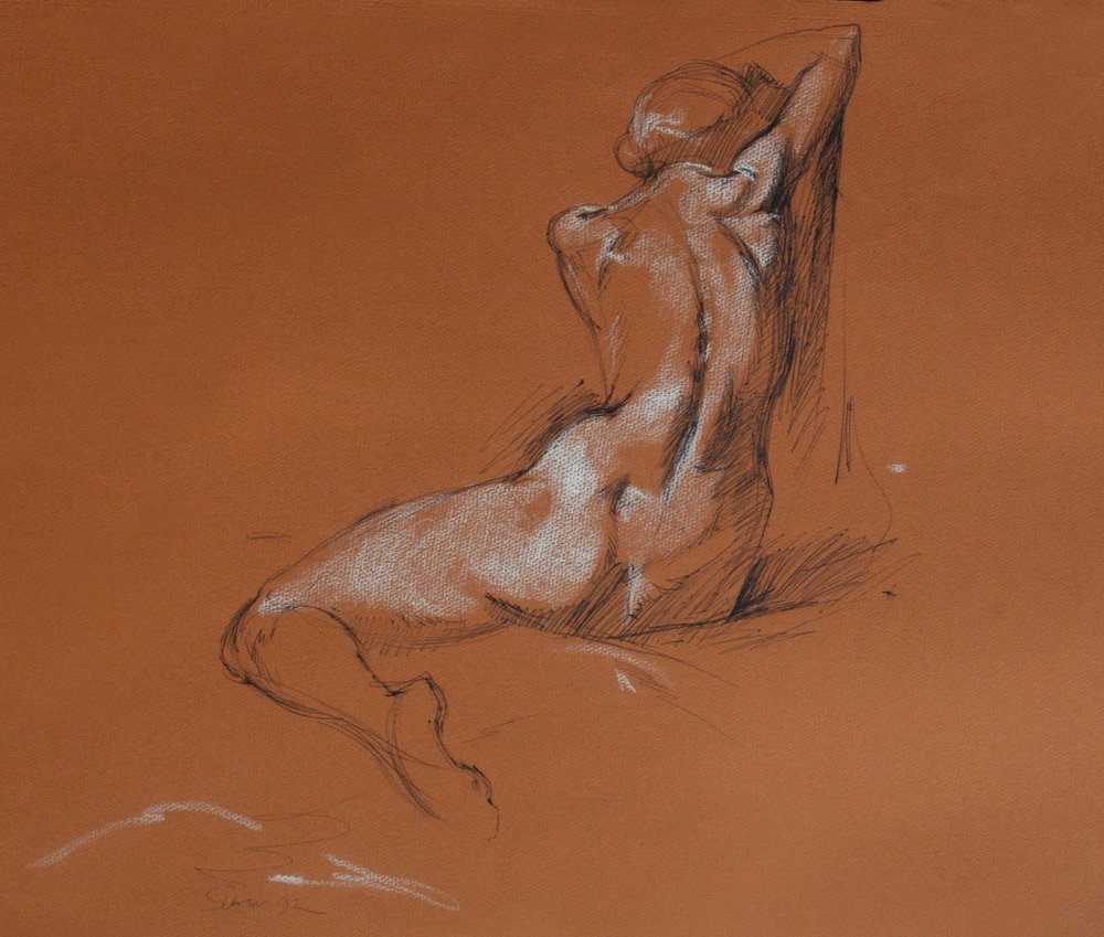
Mistake #3 is the unintentional straightening of angles on the model (angles are important because they show how much the model is leaning). It is done unconsciously on our part and must be compensated for continually. Because most people aren’t aware of this tendency the problem never gets addressed in their drawings with the result that the model looks stiff. The solution is to start to draw the angles just as you see them but then to exaggerate the angle further to compensate for your innate tendency to straighten things. The effect is that your drawing will appear to be more accurate. You have to go out of your comfort zone and force things a bit, but to the viewer the drawing will look more believable.
Mistake #4 is the equalizing of the proportions on the human body when in fact irregular proportions are the norm. Nothing is equal or symmetrical in nature even though it may appear that way upon first glance. The solution is to observe more closely and you will see the many uneven proportions that you didn’t see the first time around. To just being aware of the tendency is already a step in the right direction and will help the quality of your drawing. Another method is to measure the length of various anatomical proportions on the model and compare them what you have drawn – you will inevitably find areas where you have “equalized” measurements. The irregularities are what make the drawing interesting and demonstrate the artist’s ability to observe closely. Nature and life are full of surprises and so your drawing should contain a few as well.
Mistake #5 is not to consider the environment surrounding the figure, resulting in a figure that inadvertently appears to be cut out or “floating” in space. The solution is to include a bit of the environment in the drawing. It can be the smallest line, but it helps the figure look more solid and more grounded. For example, add a small horizontal line next to the heel to suggest the floor, or a smudge done outside of the figure to suggest the space – it is as simple as that and works like a charm! The old masters did this a lot and you may want to refer to them for ways to integrate the environment with the figure.
Mistake #6 is going to work on the details before establishing the larger forms first. It is very easy to get lost in the details, but all that work goes to waste unless you have the proper foundation forms in first. The temptation is to start “finishing” off the drawing too fast, resulting in some beautifully rendered areas that have to be erased later. The solution is to get the drawing laid in correctly from the start, always remembering to work from large to small. The main forms go in first, then put in the sub forms and the details can be considered icing on the cake.
Mistake #7 is expecting the model to look or take a pose that is “just right”. It is OK if they move a bit, give you difficult foreshortened poses, or don’t have the appearance you are looking for. The success of your drawing has very little to do with the model and everything with you, the artist. It is your job to bring the beauty, proportion, and interest to the situation, and not the other way around. Picasso is an excellent example of an artist who could take an ordinary model and turn her into a compelling work of art. The solution is to claim your power as an artist and bring the beauty, grace, and dignity (or whatever it is you are looking for) to the model before you. You can make a model into whatever you desire with some creativity on your part, however, you will not rise to the occasion and do this if you think you have to rely on the model for inspiration. That said, some models have indeed do have a special quality and can be so wonderful you can’t help but do one of your best drawings. But you shouldn’t have to rely getting a perfect model to make a successful drawing - you can do it anyway regardless of what you see before you.
Mistake #8 is making a very professional drawing except for that the hands and/or feet are less well done and not consistent with the rest of the drawing. Many beginners as well as professional artists have trouble in this area, but if you take the extra time to make the hands and feet consistent in concept with the rest of the drawing and without fudging or trying to cover up – well, then you are in the top ten percent! he solution is to specifically work on the hands and feet and study them thoroughly. Drawing from the old masters (who offer many solutions) will help. Also, draw and redraw the hands and feet until they appear to be done with ease – it takes time but is more than worth the extra effort because a great work of art is like a chain - it is only as good as its weakest link, so if you “screw up” on one part (i.e. the hands and feet), it weakens the entire work.
Mistake #9 is to think that you have learned enough, that you finally “arrived”. In art as in life, ideas unfold as you progress and ultimately it is more about the creative process than the end result. As Picasso once said, “Success is dangerous. One begins to copy oneself, and to copy oneself is more dangerous than to copy others. It leads to sterility.” The solution is to make a decision to keep your mind open so that the stage can be set for new and amazing ideas to gently reveal themselves to you. Being “right” all the time is the biggest obstacle to having an open mind - don’t spend time being right, rather, put your efforts opening your mind to new possibilities.
The ideas presented should improve the quality of your figure drawings. If you find yourself not improving then you may want to consider finding a drawing teacher or joining a drawing workshop. Life drawing (which requires a lot of discipline) is usually more successful when done in a group. One reason is that your ideas are often triggered by other artists and secondly your overall performance will be better in a group situation (it is similar to a gym in that respect). As you bring your mistakes to light and remove them, then the pure creative experience becomes more evident in your work – and your life drawing is on its way to becoming a work of art.

Painting from the live model


Sometimes when I drew from the live model, I would mix oil paints with pencil which created a whole new effect. This was a way of getting more variety into my drawings, and producing new forms of expression. The results were different as can be seen here, with a more spontaneous, colorful quality and indeed these "drawings" now became paintings. All the pieces have a lot of drawing in them, still, (although it is harder to see in the top two paintings) and are a mixture of drawing and painting. These were all done from 25 minute poses in a life drawing class, are 12" or less in size and are on primed illustration board.